English Club — Hollywood Week 2026
Not your average
summer camp
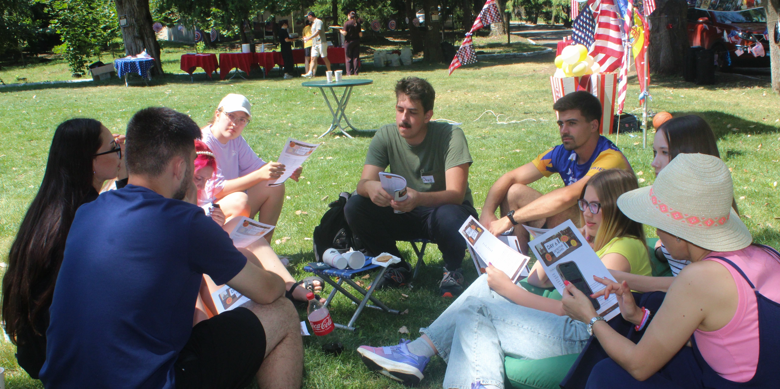
Each year, a group of Americans visit Moldova for the summer English Club. This is a yearly project, where students can practice their English, meet new people and develop multilaterally during four days of classes in the city and a two day getaway at a camp in the countryside.
The event is organized by Studentify, a non-profit initiative that hosts community meetings for youth. English Club has been a recurring event for several years, with more than 100 people attending this year’s edition.
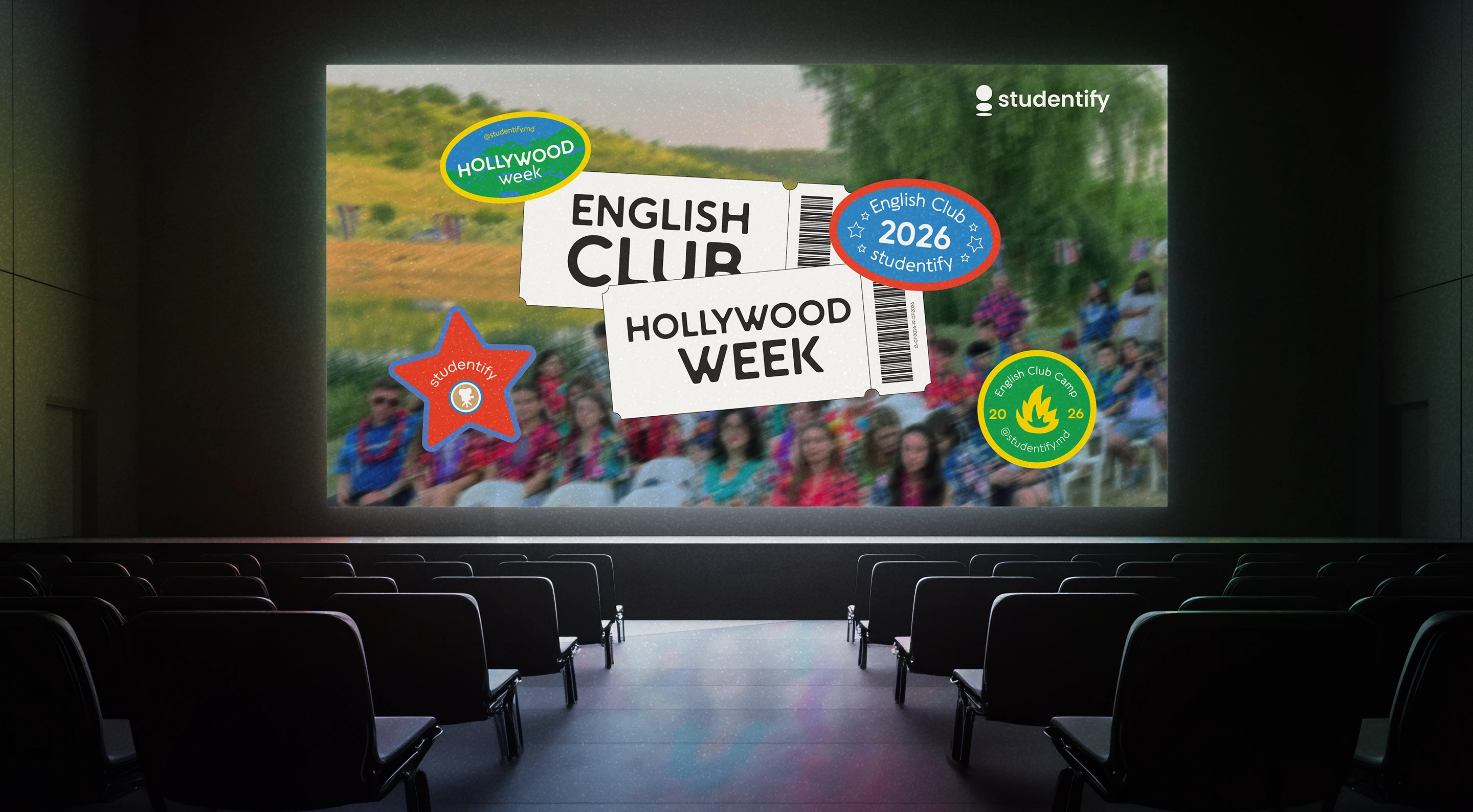
My role was to creatively direct and design the visuals for the promotional campaign, creating both the digital and physical materials. The challenge was to harmonize several themes in one single visual direction. The theme for the year 2026 was Hollywood Week, with each day addressing a different movie genre. With the project’s main topic in mind, my goal was to keep the visuals recognizable, while also avoiding the overused cliche symbols, like the UK or USA flag, architectural landmarks, traditional food, etc.
To tackle this, I combined several visual themes and focused on the lively feeling of summer camps, which resulted in a vibrant and playful look.

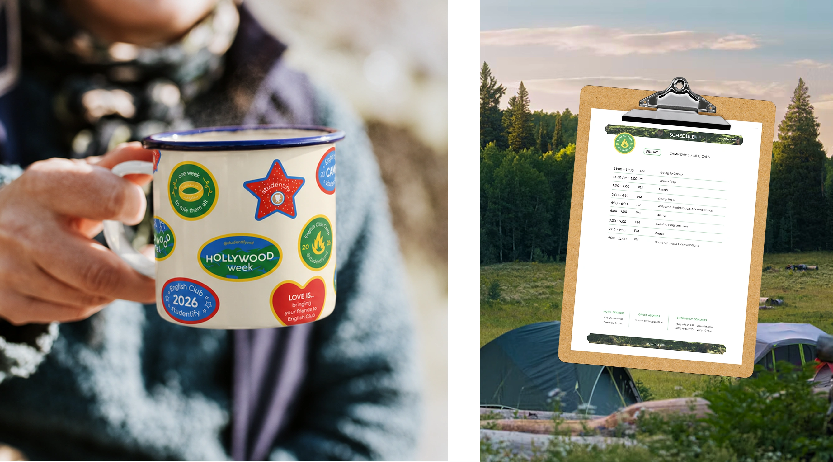
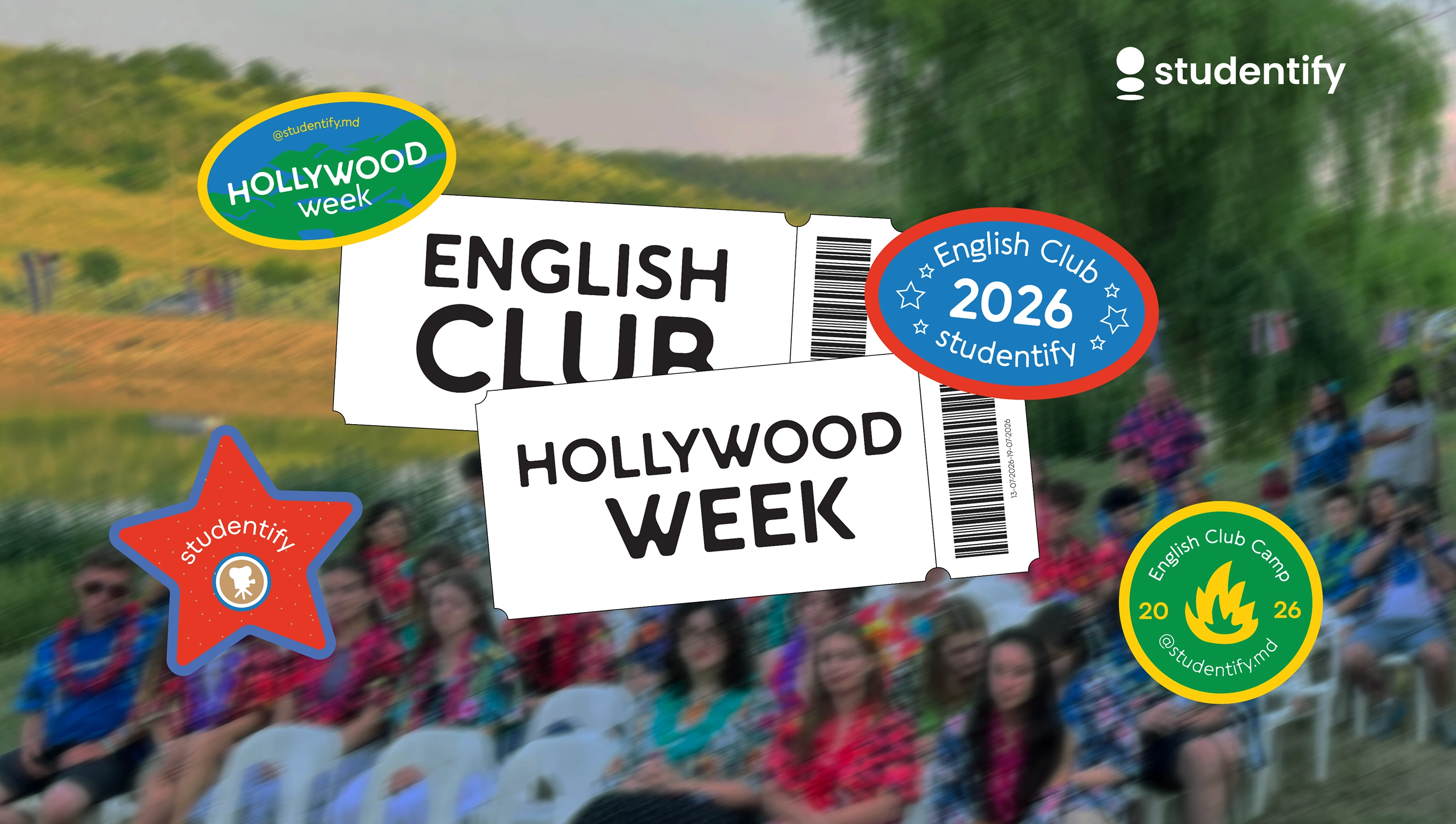
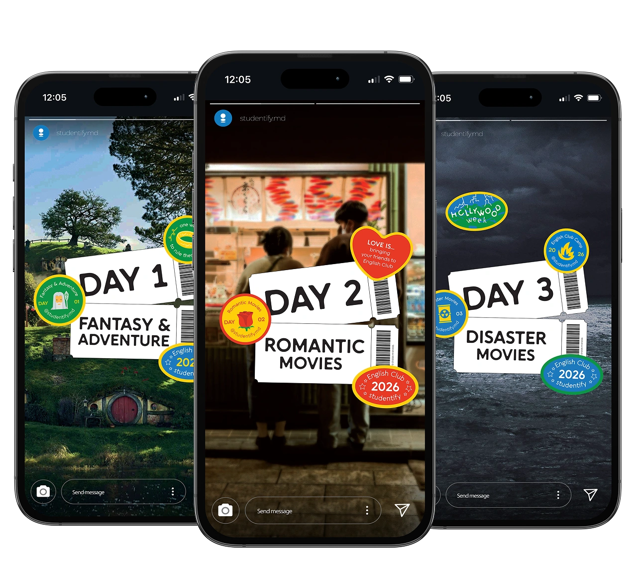
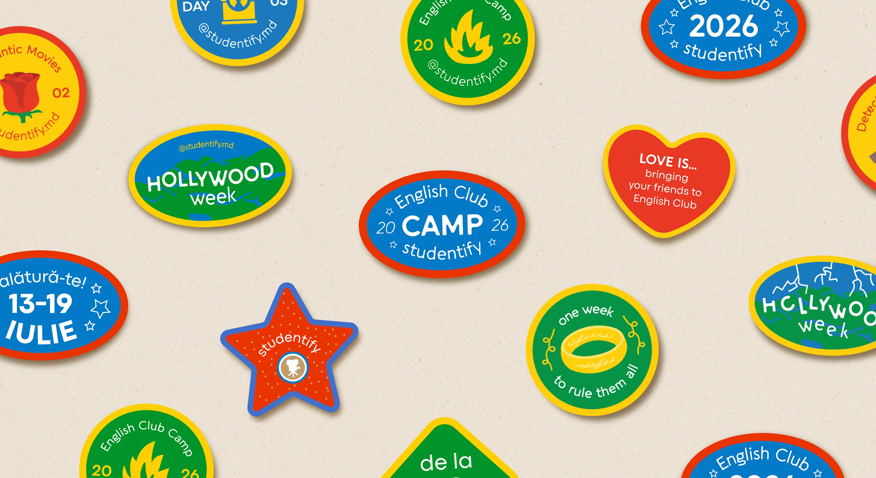
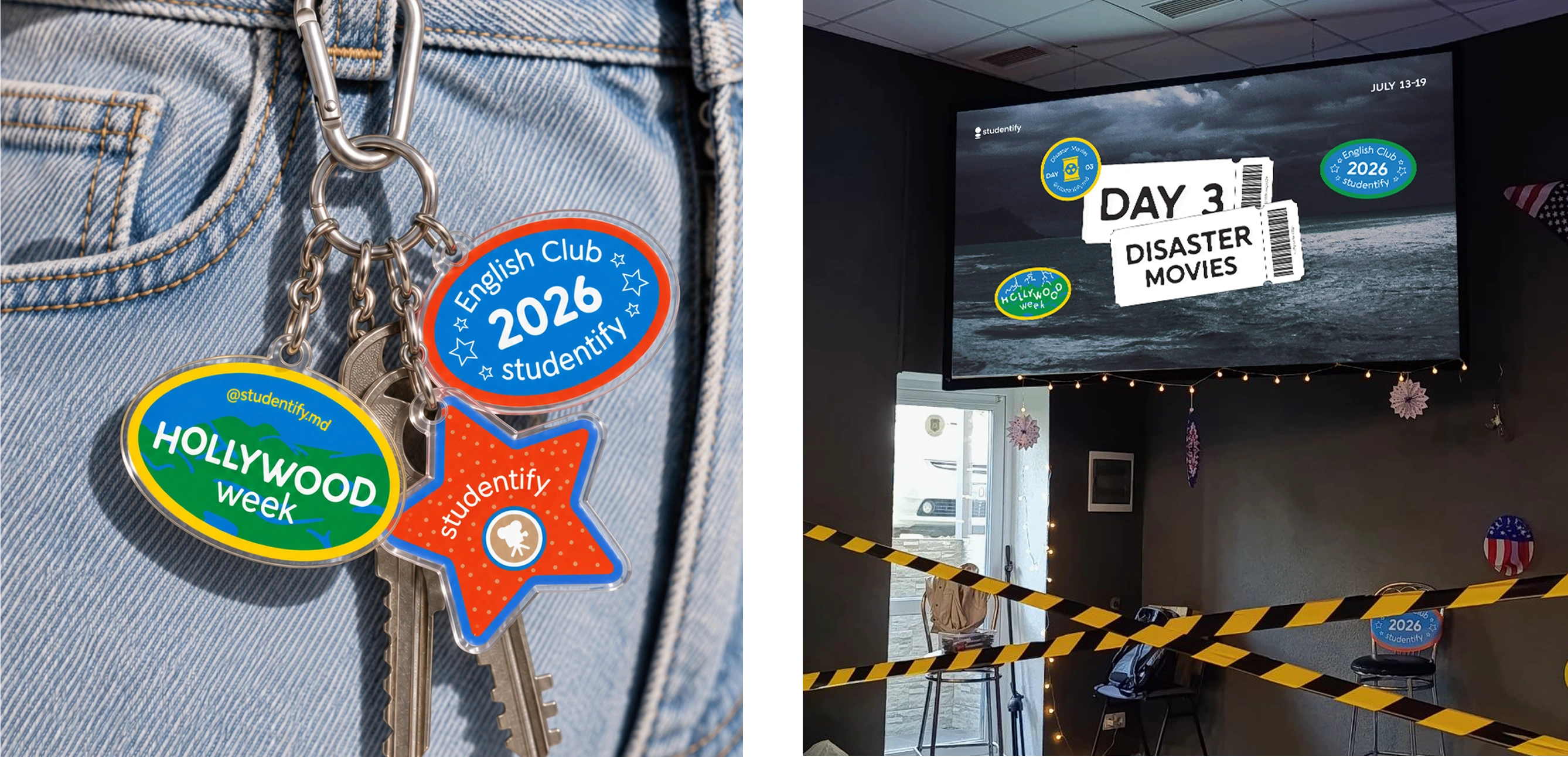
When constructing the visual identity, I chose the movie tickets as an image of Hollywood and the themed stickers, inspired by boy scout badges, as a symbol of summer camps.
This system allows enough flexibility to keep a consistent theme, both with the general branding and the different movie genres specific to each day. The system was also adapted for social media use, such as stories, posts and ads to market the event.
English Club is tailored as a two-part experience for the participants. It starts out with four days of classes to improve English, practice with native speakers, socialize and have fun. For each day, teachers and
participants received lesson materials, customized to fit the daily movie theme and structured to create an easy learning experience.
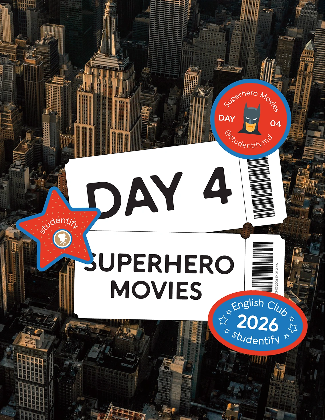
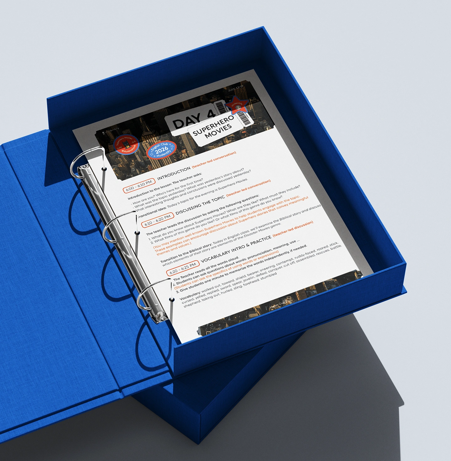
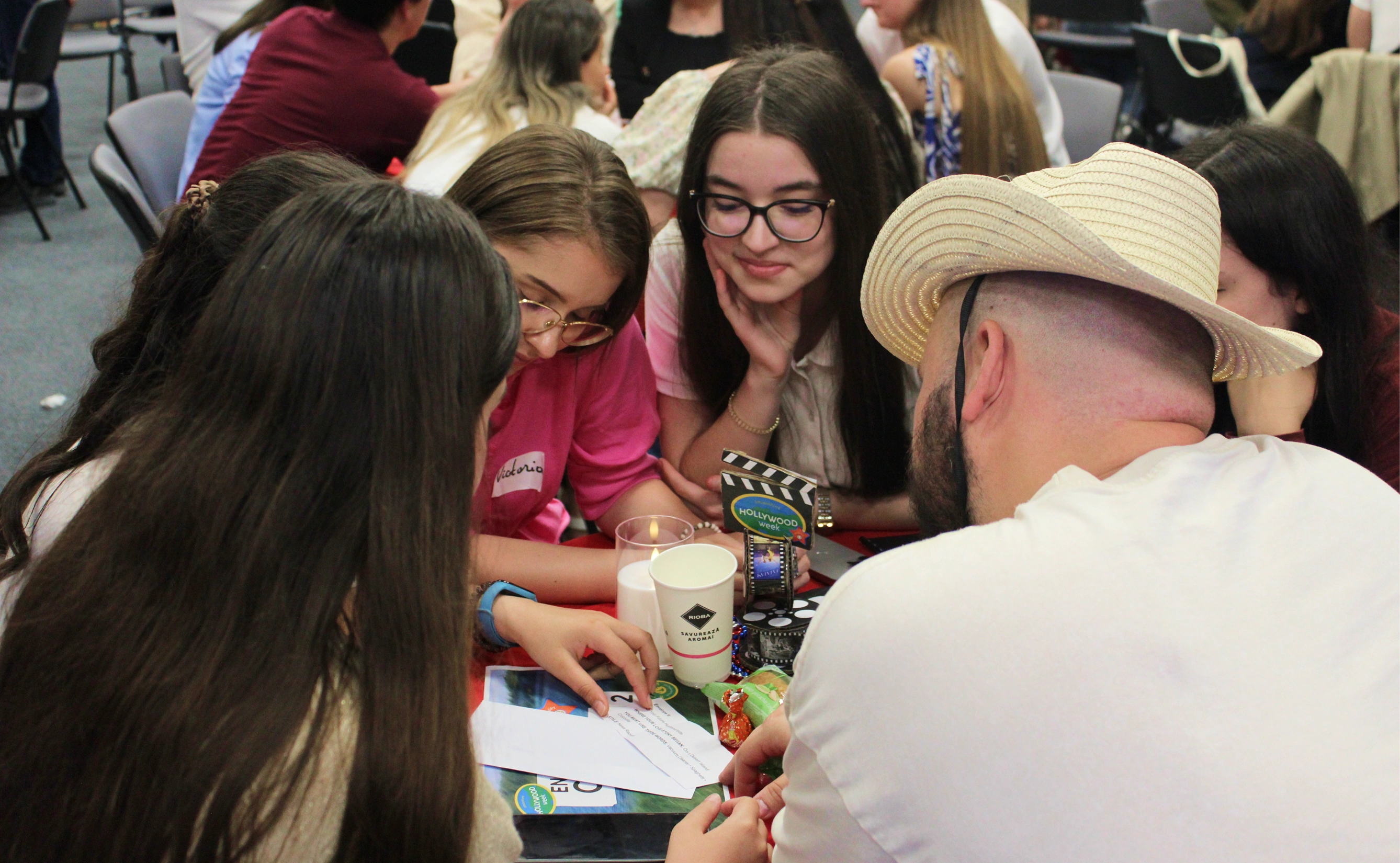
For the second part of the week, students experienced a getaway to a rural summer camp, where they enjoyed outdoor games, cultural activities and finished their last English classes. This is why, when creating the visual system it was important to make it relevant for both the context of city and of nature. To solve this tension, I chose the bright colors to express the summer atmosphere and I also included themed easter eggs in each day’s visuals to keep the experience engaging and tie all days together.