
A trustedbranddeservesa refresh
Uniflora is a beloved store chain for anyone passionate about gardening, decorative plants and is looking to add some life to their home or office. What makes it stand out is the great selection of plants and supplies available at an affordable price.
Since its establishment in 2002, Uniflora has seen expansion to multiple stores across the country. The brand has evolved, but the logo had remained generally unchanged since the beginning. That is why I chose it as a subject for my rebrand.
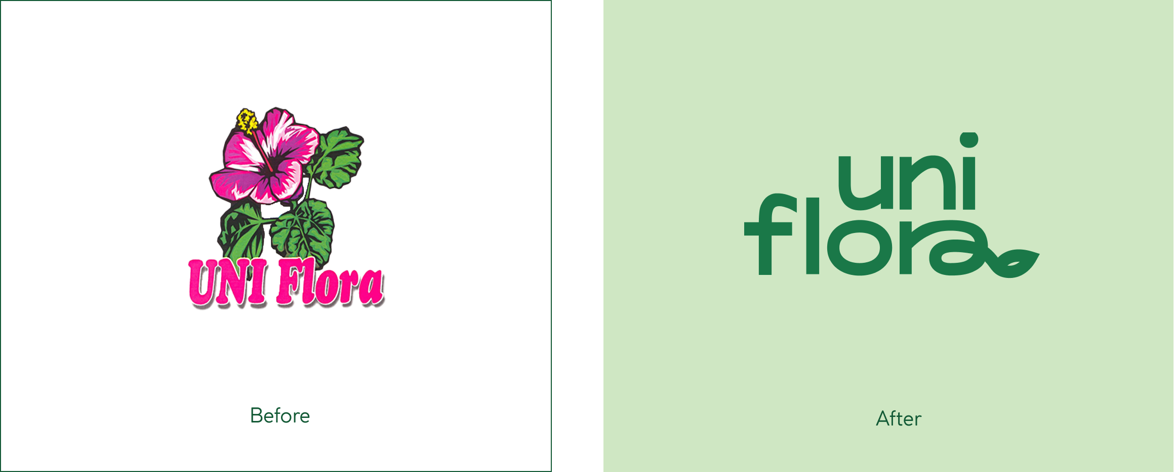
The main challenge was to modernize the logo, without losing the current customers that have built trust for the brand for over a decade. The secondary goal was also catering towards a newer, younger audience of plant lovers. This was tackled through the use of a clean, but slightly playful font that communicates trust, friendliness and accessibility.
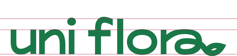
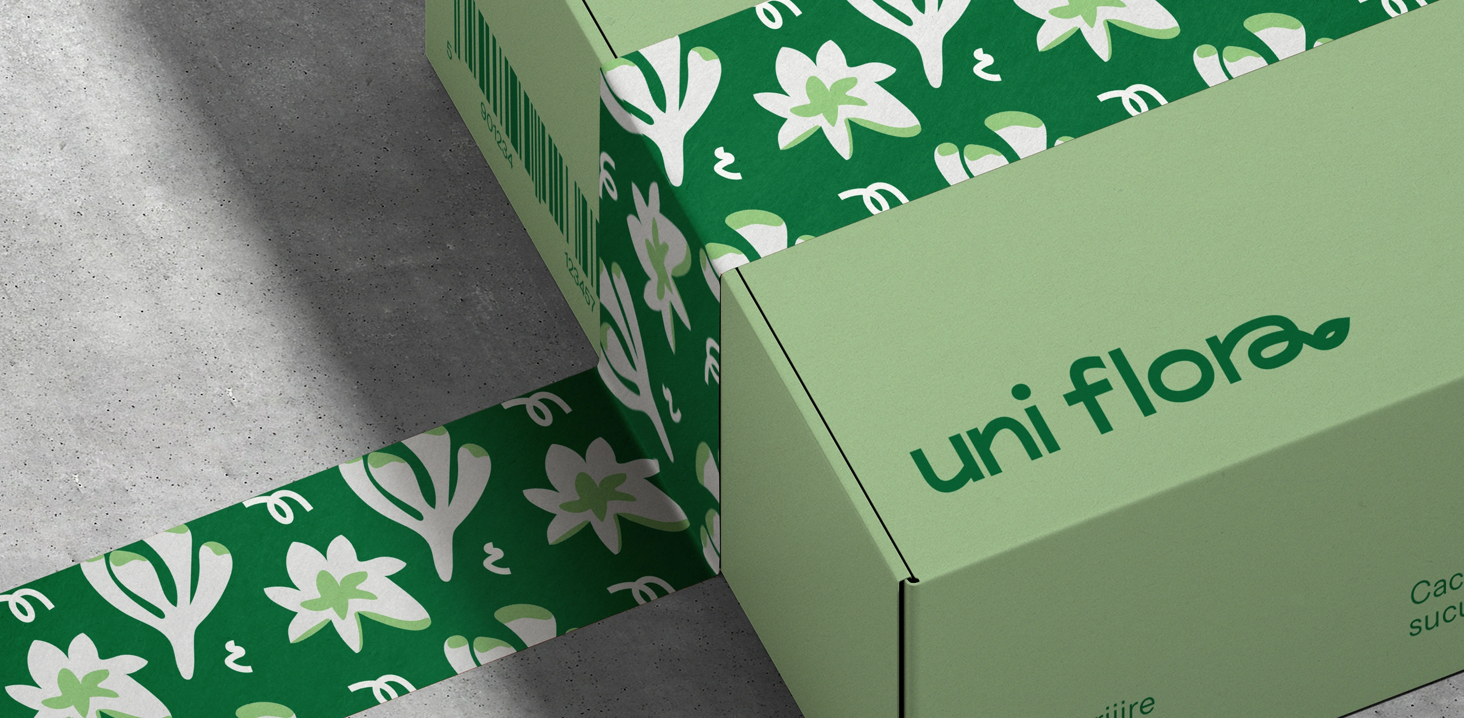
Grounded in the themes of the previous visuals, the new logo keeps the colors of green and magenta and stays rooted in the plant theme, but presents it in a more minimalist and subtle way. And the termination of the letter “a” resembling a leaf brings it all together.

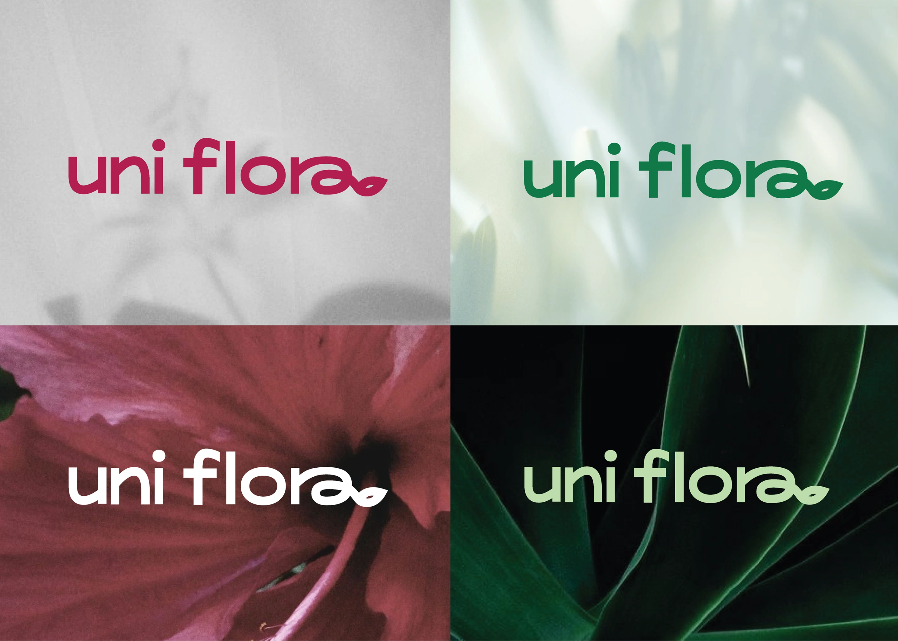
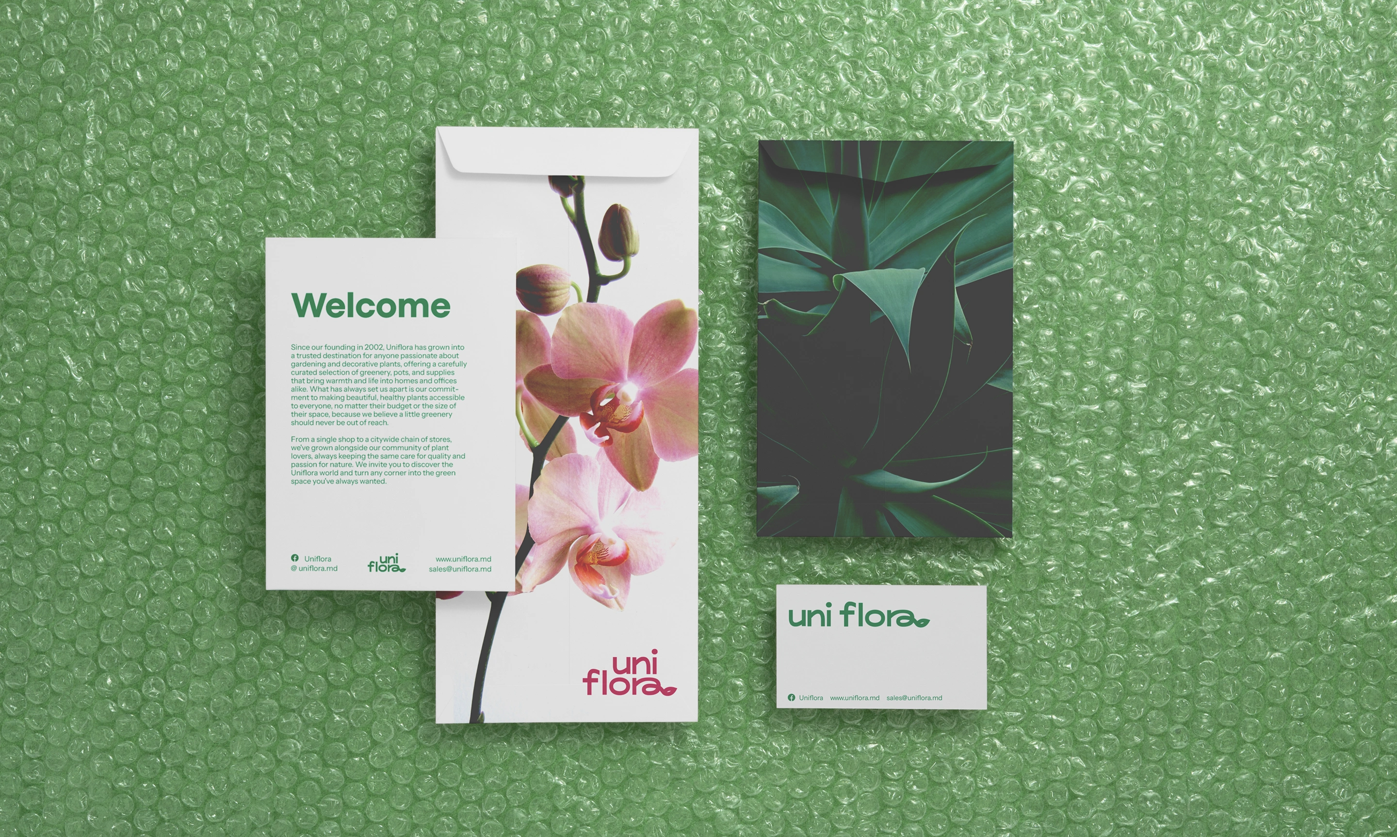
To make sure that the brand’s communication stays consistent, I set in place a visual system both for printed and digital materials.
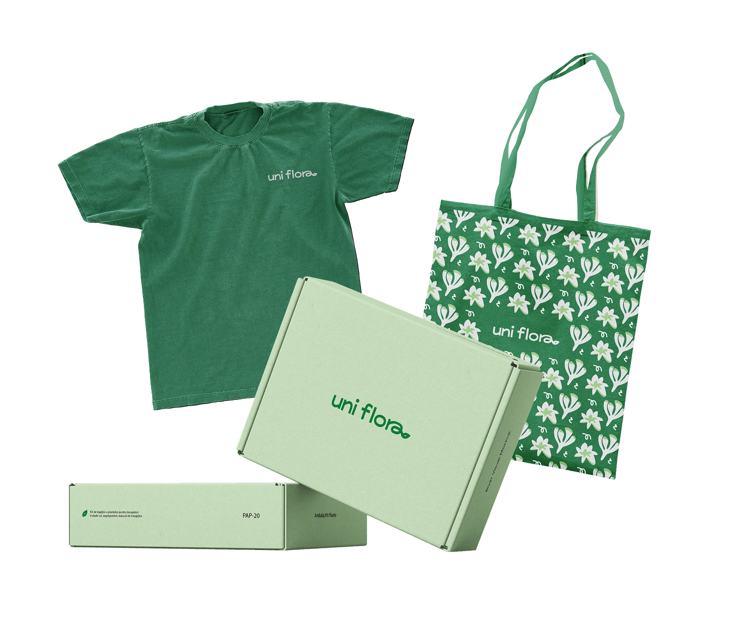
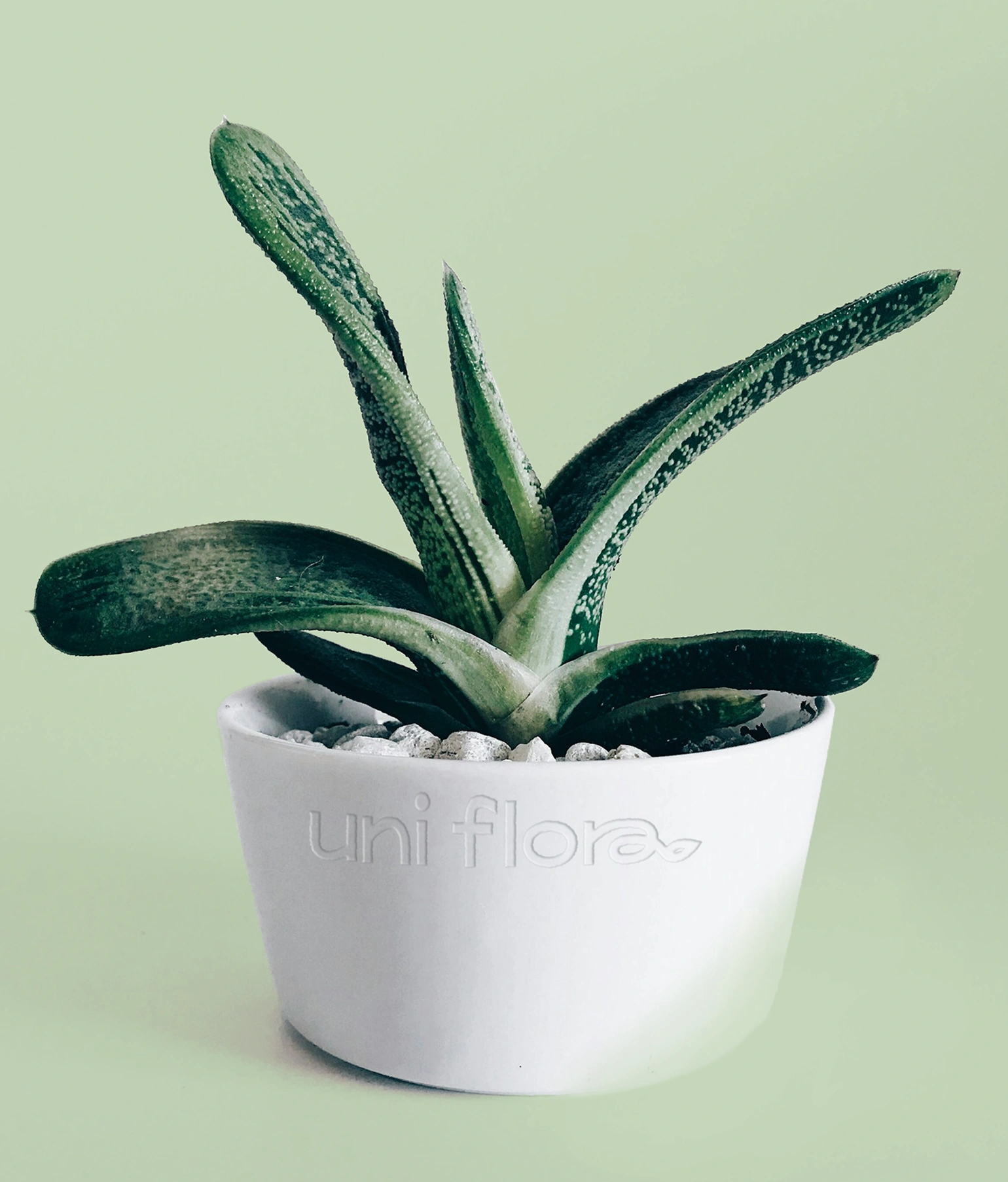
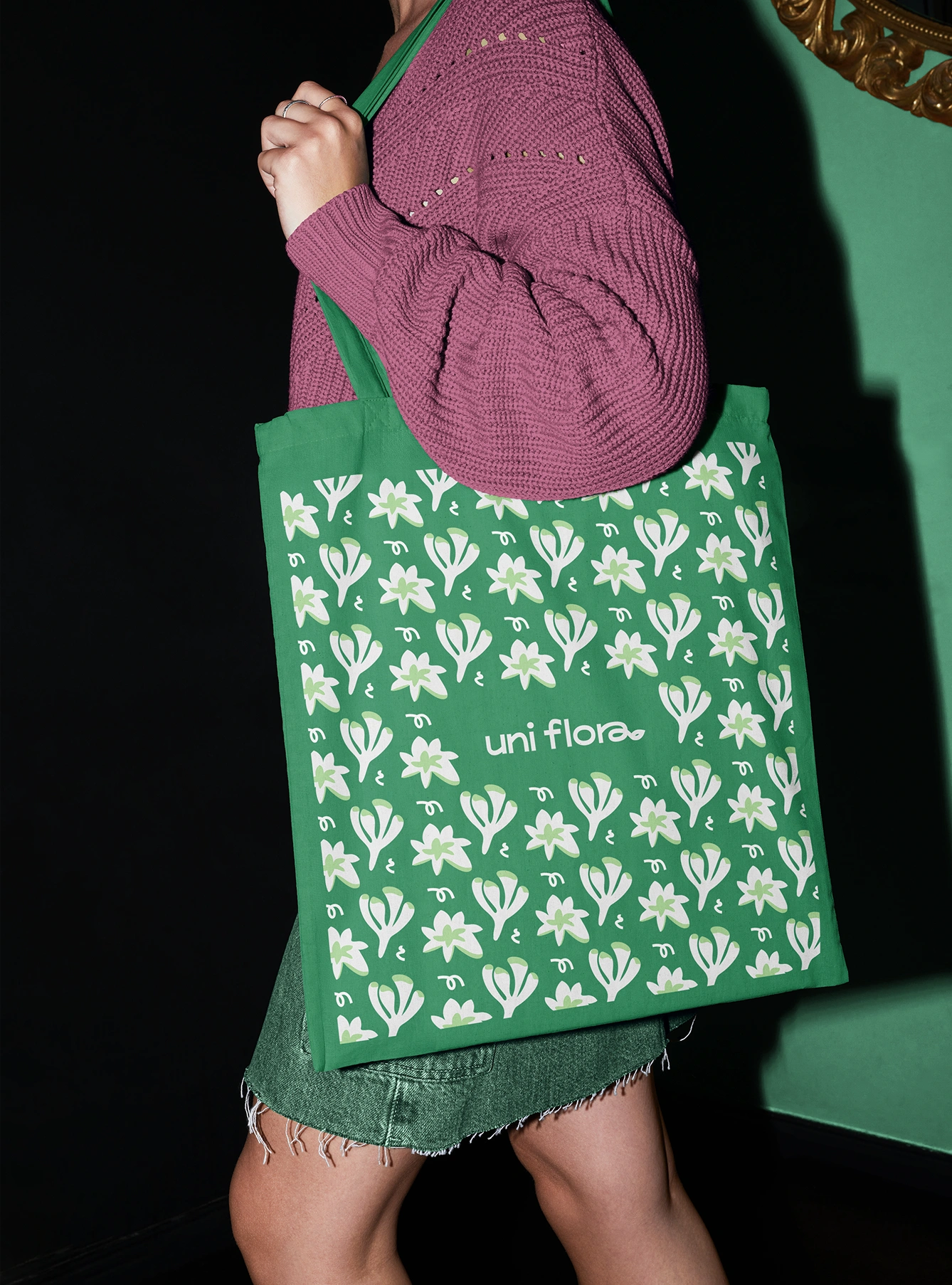
In print, the brand identity can be applied to custom packaging, tags and gardening kits, which enhance the store’s visual perception. This also builds a whole culture around gardening, making the brand more memorable for the members.
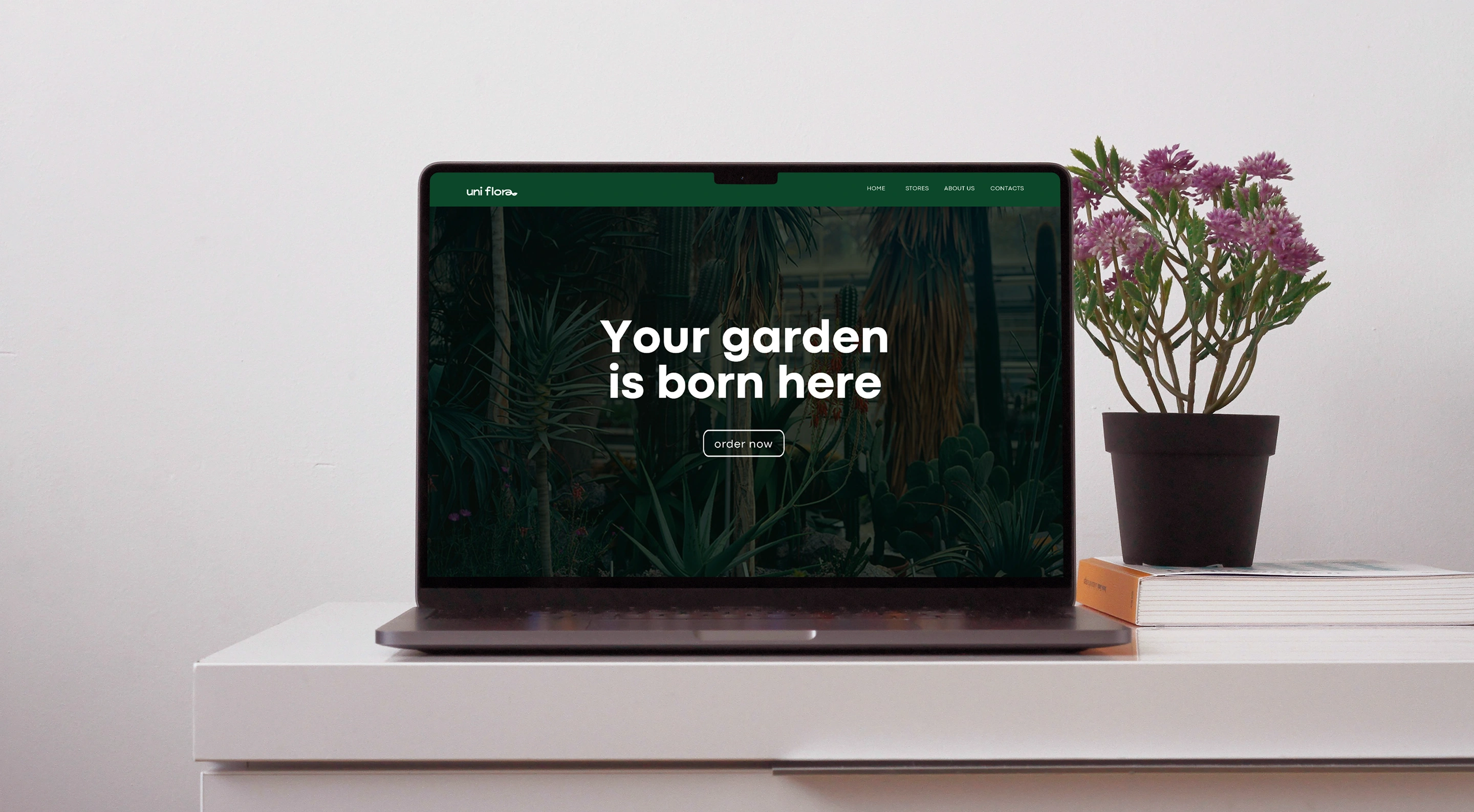
With a perspective of the future trajectory of the company, the visual identity was adapted to a mobile favicon, as well as a landing page concept.
This is presents an opportunity for the brand to extend their coverage to online users and allow for a better customer experience across digital platforms.